
Navigation
User login
Upcoming events

Recent Events
- 11 weeks 2 days ago
- 14 weeks 1 day ago
- 23 weeks 3 days ago
- 25 weeks 4 days ago
- 25 weeks 6 days ago
Newest Games


Search
Who's online
twine
Twine CSS stylesheets
Sat, 03/23/2013 - 10:05 — LThese are some CSS snippets that alter the Sugarcane format. Insert them directly into a "stylesheet" passage in your Twine games to use them. They probably won't work with Jonah, though.
I don't consider myself a graphic designer or web designer, so these are to be regarded solely as amateur efforts.
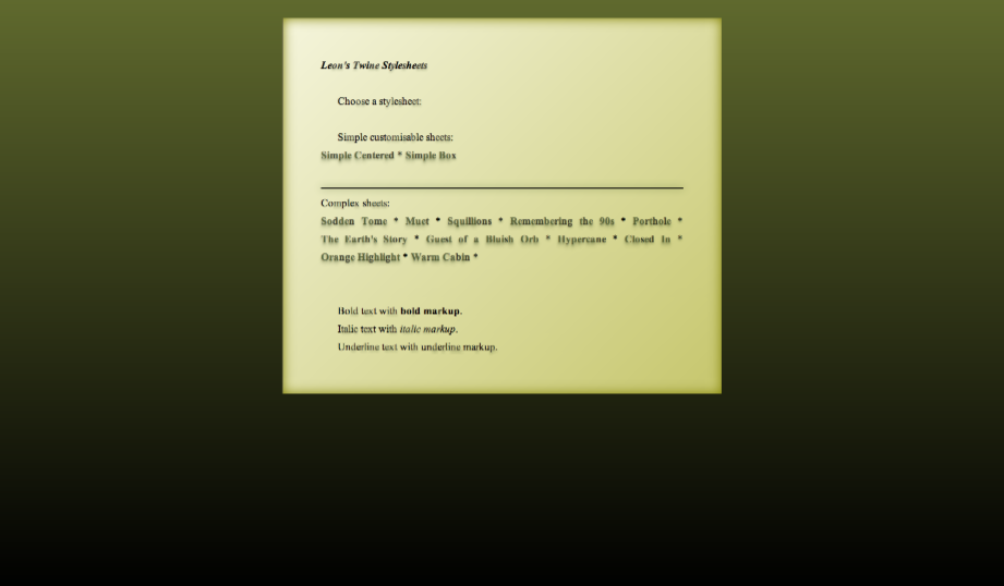
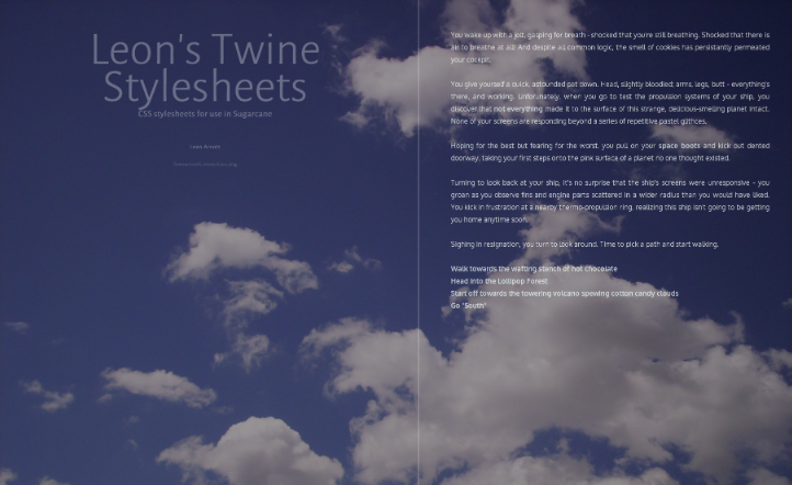
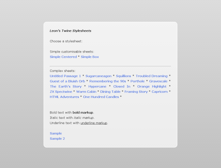
Click here for live previews of all these stylesheets!
"Sodden Tome"
This requires Twine 1.4. Designed for slimy gloomy or spooky stories. "Wow! It really looks like it fell in a swamp!" - Marsh Boggart 341, Death Quadrant 9.
html {
  background-image: linear-gradient(to bottom,  hsl(70, 39%, 30%), black);
  background-image: -webkit-linear-gradient(top,  hsl(70, 39%, 30%), black);
  background-attachment: fixed;
  background-color: black;
}
body {
  background-color: transparent;
  margin: 2% 0 0 0;
  font-size: 100%;
}

#passages {
  background-image: linear-gradient(-135deg, beige, #c6c66c);
  background-image: -webkit-linear-gradient(-45deg, beige, #c6c66c);
  background-color: beige;
  width: 40%;
  margin:auto;
  margin-bottom: 5%;
  padding: 2em;
  box-shadow: inset 0 0 2em olive;
}

.passage {
  margin: 0px;
  padding: 2em;

  /* Text formatting */
  color: black;
  font-family: "Times New Roman", serif;
  text-align:justify;
}
.passage br + .char {
  margin-left: 1.6em;
}

.char.e + .char, .char.t + .char, .char.a + .char, .char.o + .char, .char.i + .char, .char.n + .char, .char:nth-child(8n) {
  text-shadow: 0em 3px 0.3em hsla(82, 39%, 20%, .25);
  color: rgba(0,0,0,0.7);
}

/* No sidebar */
#sidebar {
  display:none;
}

hr {
  border: 0;
  height: 2px !important;
  background-color: black;
  box-shadow: 0 0 1em darkolivegreen;
}

/* Links */
.passage a .char {
  color: hsla(82, 39%, 20%, .75);
  text-shadow: 0em 3px 0.2em hsla(82, 39%, 20%, .25), 0em 6px 0.4em hsla(82, 39%, 20%, .25);
}
.passage a:visited .char {
  color: hsla(37, 39%, 20%, .75);
  text-shadow: 0em 3px 0.2em hsla(37, 39%, 20%, .25), 0em 6px 0.4em hsla(37, 39%, 20%, .25);
}
.passage a:hover {
  text-decoration: none;
}
.passage a:hover .char {
  color: darkgreen !important;
}
.passage a:visited:hover .char {
  color: darkred !important;
}
"Muet"
This requires Twine 1.4. The background image is not included - but if you add an embedded image with the name "background", it will be used by this stylesheet! Also, this has no sidebar, only the StoryTitle, StorySubtitle and StoryAuthor.
@import url(http://fonts.googleapis.com/css?family=Alegreya+Sans:300|Oxygen:400,700&subset=latin,latin-ext);

html {
  background: [img[background]] fixed, dodgerblue;
  background-size: cover;
  min-height: 100%;
  height:100%;
}
body {
  background-color: rgba(0,0,0,0.4);
  background-attachment: fixed;
  margin: 0;
  padding: 0% 15% 0% 5em;
  font-size: 100%;
  font-family: Oxygen, "Century Gothic", sans-serif !important;
  font-weight: 300;
  min-height: 100%;
}
#sidebar, #passages {
  padding-top: 4em;
  padding-bottom: 0em;
}
#passages {
  margin-left: 60%;
  width: 50%;
  min-height: 100%;
  padding-bottom: 0;
  margin-bottom: 0;
  border: 0;
}
#passages::before {
  border-left: 3px solid rgba(255,255,255,0.2);
  position:fixed;
  height:100%;
  left: 50%;
  top:0;
  content:'';
}
.passage {
  margin: 0px;
  color: white;
  opacity: 0.7;
  font-size: 100%;
  text-align:justify;
  margin:auto;
  padding: 0px 0px 5em 0px;
}
.passage a {
  color: #cde8ff;
  opacity: 1;
}
.passage a:hover {
  color: white;
  text-decoration: none;
  border-bottom: 1px white solid;
}
.passage a:visited {
  color: #d7ffcd;
}
#sidebar {
  left: 1em;
  width: 50%;
  font-family: "Alegreya Sans","Century Gothic",sans-serif !important;
}
#sidebar li {
  color: white !important;
  text-align: center;
  opacity: 0.3;
}
#sidebar #storyTitle {
  font-size: 4em;
  line-height:0.8em;
}
#sidebar > :not(.storyElement) {
  display:none;
}
/* Shrink the page when viewed on devices with a low screen width */
@media screen and (max-width: 1600px) {
  .passage, #sidebar { font-size: 90%; }
}
@media screen and (max-width: 1200px) {
  #sidebar { font-size: 70%;}
  .passage { font-size: 85%;}
}
@media screen and (max-width: 960px) {
  #passages::before { display:none; }
  #sidebar { position: relative; width: 100%;}
  #passages { margin: 0; padding: 5%; width: 90%; border: 0; }
}

"Simple Centered"
The "simple" stylesheets are designed to be shorter and more customisable than the others. This one simply consists of passage text, centered horizontally AND vertically inside the window, along with a colour gradient background. See the code comments for places where colours and values can easily be changed.
html {
  width: 100%;

  /* Vertical colour gradient */
  background-image: linear-gradient(to bottom,  black, midnightblue);
  background-image: -webkit-linear-gradient(top,  black, midnightblue);
  background-attachment: fixed;

  /* Fallback colour */
  background-color: midnightblue;

  /* Vertical centering */
  height: 100%;
  display: table;
}
body {
  /* Remove default styles */
  font-size: 100%;
  background-color: transparent;
  margin: 0;

  /* Vertical centering */
  height:100%;
  display:table-cell;
  vertical-align: middle;
}
#passages {
  border-left: 0px;
  margin: 0;
  /* Keep a gap at the top and bottom of the page,
      when the text is longer than the window's height. */
  padding: 5% 0;
}

.passage {
  /* Passage width */
  width: 60%;
  /* Horizontal centering */
  margin: 0 auto;

  /* Text formatting */
  color: white;
  font-size: 100%;
  text-align:center;
}

/* No sidebar */
#sidebar {
  display:none;
}

/* Links */
a.internalLink, a.externalLink {
  color: cornflowerblue;
}
a.internalLink:hover, a.externalLink:hover {
  color: lightskyblue;
  text-decoration: none;
}

/* Shrink the page when viewed on devices with a low screen width */
@media screen and (max-width: 960px) {
  .passage { font-size: 90%; width: 70%; }
}
@media screen and (max-width: 840px) {
  .passage {  font-size: 87.5%; width: 80%; }
}
@media screen and (max-width: 720px) {
  .passage { font-size: 75%; width: 90%; }
}
"Simple Box"
Displays the passage text in a box, centered in the upper middle of the page, in front of a colour gradient.
See the code comments for colours and values that can be customised.
html {
  /* Vertical colour gradient */
  background-image: linear-gradient(to bottom,  gainsboro, silver);
  background-image: -webkit-linear-gradient(top,  gainsboro, silver);
  background-attachment: fixed;

  /* Fallback colour */
  background-color: silver;
}
body {
  /* Remove default styles */
  background-color: transparent;
  margin: 10% 0 0 0;
  font-size: 100%;
  /* Used to center the box */
  text-align: center;
}

#passages {
  /* Box background (white with 70% opacity) */
  background-color: rgba(255, 255, 255, 0.7);

  /* Border */
  border: 2px solid white;

  /* Rounded corners */
  border-radius: 1em;

  /* Box width */
  width: 60%;

  /* Center the box */
  display: inline-block;
  min-height: 40%;
  margin:auto;
  margin-bottom: 5%;
  padding: 0px;
}

.passage {
  margin: 0px;
  /* Inner margin within the box */
  padding: 2em;

  /* Text formatting */
  color: black;
  font-size: 100%;
  text-align:justify;
}

/* No sidebar */
#sidebar {
  display:none;
}

/* Links */
a.internalLink, a.externalLink {
  color: royalblue;
}
a.internalLink:hover, a.externalLink:hover {
  color: deepskyblue;
  text-decoration: none;
}

/* Shrink the page when viewed on devices with a low screen width */
@media screen and (max-width: 960px) {
  .passage { font-size: 90%;}
  #passages { width: 70%; }
}
@media screen and (max-width: 840px) {
  .passage {  font-size: 87.5%; }
  #passages { width: 80%; }
}
@media screen and (max-width: 720px) {
  .passage { font-size: 75%; }
  #passages { width: 90%; }
}

"Squillions"
"It's a Twine game that you can imagine James Bond playing." ? Ian Bogost.
head {
  box-shadow: inset 0px 0px 30em #bbb;
  width:100%;
  height:100%;
  display:block;
  position:fixed;
}
head * {
  display:none;
}
body {
  background-color:#fff;
  margin: 0;
  text-align:center;
}
#passages {
  border-left: 0;
  margin: 0;
  padding: 0;
  line-height:100vh;
}
.passage {
  position:absolute;
  top: 0;  bottom: 0;  left: 0;  right: 0;
  width: 75%;
  height: 75%;
  margin:auto;
  font: bold 6em/1.25em Helvetica, "Helvetica Neue", Arial, sans-serif;
  color: #000;
  letter-spacing: -0.05em;
  text-align:center;
}
#sidebar {
  display:table;
  position:fixed;
  top: 0; left: 0;
  width:100%;
  height:100%;
}
#sidebar #title {
  display:table-cell;
  vertical-align:middle;
  text-align:center;
}
#sidebar #title #storyTitle {
  font: bold 12em/1.25em Helvetica, "Helvetica Neue", Arial, sans-serif;
  letter-spacing: -0.05em;
  color:rgba(0,0,0,0.15);
}
#title :not(#storyTitle){
  display:none;
}
#storymenu, #snapback, #restart, #share, #credits {
  display:none;
}
a.internalLink:hover, a.externalLink:hover {
  color:#de0000 !important;
  text-decoration: none;
}
a.internalLink:nth-child(3n), a.externalLink:nth-child(3n) {
  color: #666;
}
a.internalLink:nth-child(3n+1), a.externalLink:nth-child(3n+1) {
  color: #777;
}
a.internalLink:nth-child(3n+2), a.externalLink:nth-child(3n+2) {
  color: #888;
}
@media screen and (max-width: 960px) {
  body { font-size: 50%; }
}
@media screen and (max-width: 840px) {
  body { font-size: 40%; }
}
@media screen and (max-width: 720px) {
  body {
    font-size: 30%;
  }
}
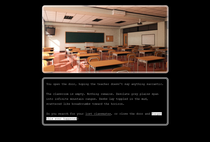
"The Earth's Story Illustrated"
Best used with a dissolve transition.
This stylesheet is capable of displaying a 480-pixels-tall scene image above every passage's text! You can set scene images using Tag CSS. To assign, say, the image "classroom_afternoon" to the tag "classroom", simply create a stylesheet tagged "stylesheet classroom" and put this in it:
.passage .header {
  background-image: [img[classroom]];
}
And then tag various passages with "classroom" to use the image. To have multiple images overlaid on each other, add multiple img declarations separated by commas, in order from frontmost to rearmost:
.passage .header {
  background-image: [img[character-funnycry]], [img[classroom]];
}
That's how you do it!
#sidebar {
  display:none;
}
body {
  margin: 0;
  padding: 0;
  height:100%;
}
#passages {
  margin:0;
  padding: 0;
  height:100%;
}
#passages * {
  box-sizing: border-box;
  -moz-box-sizing: border-box;
}
.passage {
  position:relative;
  width: 60%;
  font-size:2em;
  font-family: "Lucida Sans Typewriter", Consolas, Monaco, monospace;
  margin: 2em auto 0 auto;
}
.passage .header {
  width:100%;
  height:480px;
  min-height: 480px;
  border: #fff double 0.5em;
  border-radius: 1em;
  margin: 0 auto 1.5em auto;
  padding: 0;
  background-position: center;
  background-repeat: no-repeat;
}
.passage .content {
  top: 500px;
  width:100%;
  border: #fff double 0.5em;
  border-radius: 1em;
  padding: 1em;
}
a.internalLink, a.externalLink {
  border-bottom: solid #fff 1px;
  color:#eee;
  font-weight:normal;
}
a.internalLink:hover, a.externalLink:hover {
  text-decoration:none;
  border-bottom: none;
  color:#000;
  background-color:#fff;
  font-weight:normal;
  padding-left: 0;
}
a.internalLink:active, a.externalLink:active {
  border-bottom: 0;
}
@media screen and (max-width: 960px) {
  .passage {
    font-size: 1.5em;
  width: 75%;
  }
}
@media screen and (max-width: 640px) {
  .passage {
    font-size: 1.25em;
  width: 95%;
  }
}

"Remembering the 90's"
Best used with an instant passage transition.
body {
  background:LightGrey;
  color: #000;
  font: medium "Times New Roman", Times, serif;
  margin: auto;
  padding: 8px;
}
#passages {
  margin: auto;
  border: 0;
  padding: 0;
}
.header, .footer {
  border: 1px inset;
  margin: 0.5rem auto;
}
.passage {
  font: inherit;
  line-height: inherit;
  margin: auto;
}
.passage ul {
  padding: 0;
  text-align: left;
}
.passage li {
  display:inherit;
  margin: 0;
}
a, #sidebar #snapback, #sidebar #restart, #sidebar #share, .menu div {
  font-weight:inherit !important;
  text-decoration: underline !important;
  color: #00F !important;
}
a.visited {
  color: #7F007F;
}
#sidebar {
  font: inherit !important;
  position:static;
  width: auto;
  list-style: disc outside;
}
#sidebar ul {
  padding: inherit;
}
#sidebar li {
  color: inherit;
  text-align:inherit;
  margin:inherit;
  display:inline;
}
#sidebar #titleSeparator {
  display:none;
}
#sidebar #title, #sidebar #title:hover {
  color:inherit;
}
#sidebar #storyTitle, #sidebar #storyTitle:hover {
  font-size: 2rem;
  margin: .67rem 0;
  font-weight:bold;
}
#sidebar #storySubtitle {
  font-size: inherit;
  font-weight:bold;
}
#sidebar #storyAuthor::before {
  content: "by ";
}
#sidebar #storyAuthor {
  font-size:medium;
  display:block;
  font-weight:bold !important;
}
#sidebar #credits {
  display:block;
  font-size: smaller;
  padding: inherit;
}
#snapbackMenu::before {
  content: "Rewind to:";
  font-weight:bold;
}
#shareMenu::before {
  content: "Share this story at:";
  font-weight:bold;
}
.menu::before {
  content: "Rewind to:";
  font-weight:bold;
}
.menu, .menu div:hover {
  position: static;
  background-color:inherit;
  color:inherit;
  opacity:1;
  border:0;
  font:inherit;
  line-height:inherit;
}
.menu div {
  margin: 0 1.12rem;
  display: list-item;
  list-style:disc outside;
}

"Porthole"
Features: Very roughly inspired by the title screen of "The Sea Will Claim Everything"; Designed for games with brief passage text. No sidebar.
body {
  width: 100%;
  margin-left: 0;
  text-align:center;
}
#passages {
  position:relative;
  display:inline-block;
  font-size: 1.5em;
  background-color:skyblue;
  background-image: -webkit-linear-gradient(top, #87ceeb 0%,#87ceeb 75%,#008eed 75%,#008eed 100%);
  background-image: linear-gradient(to bottom, #87ceeb 0%,#87ceeb 75%,#008eed 75%,#008eed 100%);
  width: 60em;
  height: 60em;
  border-radius: 30em;
  border: darkgoldenrod 1em solid;
  margin-left: 0;
  padding-left: 0;
}
.passage {
  position: absolute;
 text-align:center;
  top: 20em;
  bottom: 0;
  margin: -10em 5em auto 5em;
  display:inline-block;
  width: 40em;
  height: 40em;
  overflow-y: hidden;
  box-shadow: 0 0 2.5em 2.5em;
}
a.internalLink, a.externalLink {
  color: white;
  font-size: 1.2em;
}
a.internalLink:hover, a.externalLink:hover {
  color: white;
  text-decoration: none;
  text-shadow: 0 0 0.5em white;
}
.passage .body {
  color: white;
}
#sidebar {
  display:none;
}
@media screen and (max-width: 960px) {
  body { font-size: 55%; }
}
@media screen and (max-width: 840px) {
  body { font-size: 45%; }
}
@media screen and (max-width: 720px) {
  body { font-size: 40%; }
}

"The Earth's Story 1.0"
Features: No sidebar. Similar to ZX Spectwine, below. Reminiscent of early 90s Nintendo RPGs - hence its gray sensibilities. Use Tag CSS and tag your passages "mint", "strawberry", "banana" or "peanut" to get different coloured borders for specific passages!
body {
  margin: 0;
  background-color:#000;
}
#passages {
  margin: 0;
  padding: 0;
  border: 0;
}
.passage {
  width: 40%;
  min-width: 26em;
  height: 33%;
  min-height: 33%;
  font-family: Helvetica, "Helvetica Neue", Arial, sans-serif;
  letter-spacing: 0.1em;
  padding: 1.5em;
  padding-left: 2em;
  font-size:1.8em;
  background-color:#000;
  color:#eee;
  margin: 10%;
  border: silver ridge 0.8em;
  border-radius: 1em;
}
.passage[data-tags~=mint] {
  border-color: MediumAquaMarine;
}
.passage[data-tags~=strawberry] {
  border-color: HotPink;
}
.passage[data-tags~=banana] {
  border-color: Gold;
}
.passage[data-tags~=peanut] {
  border-color: Peru;
}
.content::before {
  content: '•';
  position: relative;
  left: -0.6em;
  margin-right: -0.4em;
}
a.internalLink, a.externalLink {
  border-bottom: solid #fff 1px;
  color:#eee;
  font-weight:normal;
}
a.internalLink:hover, a.externalLink:hover {
  text-decoration:none;
  border-bottom: solid #fff 2px;
  color:#fff;
  font-weight:normal;
  padding-left: 0;
}
a.internalLink:active, a.externalLink:active {
  border-bottom: 0;
}
#sidebar {
  display:none;
}
"Hypercane 1.1"
As used in Myriad
Features: Sidebar is converted to a top bar (minus Share); vaguely resembles System 6, but nowhere near enough for true aficionados.
body {
  margin: 10% 0 10% 0;
}
#passages{
  margin: 0;
  padding: 0;
  border: 0;
}
.passage, #sidebar * {
  font-family: Geneva, "Helvetica Neue", Helvetica, sans-serif;
  color:#000;
  text-align:left;
}
.passage {
  border-radius: 0.2em;
  width: 60%;
  margin: auto;
  padding: 2em;
  font-size:1.5rem;
  background-color:#fff;
  border: solid #000 0.05em;
  box-shadow: #000 0.5em 0.5em 0;
}
a.internalLink, a.externalLink {
  border: solid #000 0.05em;
  white-space: nowrap;
  padding: 0.1em 0.2em 0.1em 0.2em;
  border-radius: 0.5em;
  color:#000;
}
a.internalLink:hover, a.externalLink:hover {
  text-decoration: none;
  box-shadow: #000 0 0 0 0.1em;
  color:#000;
}
a.internalLink:active, a.externalLink:active {
  color: #fff;
  background-color:#000;
}
body {
  background:url(data:image/png;base64,iVBORw0KGgoAAAANSUhEUgAAAAQAAAAEAQMAAACTPww9AAAABGdBTUEAALGPC/xhBQAAAAZQTFRFAAAA////pdmf3QAAAA5JREFUeF5jOACEBgwGAAnIAeGomjuiAAAAAElFTkSuQmCC);
}
#sidebar {
  position:absolute;
  top:0px;
  left:0px;
  width:99.2%;
  overflow-x:hidden;
  background-color:#fff;
  border-bottom: solid #000 1px;
}
#sidebar * {
  color: #000 !important;
  font-size:1.5rem;
  background-color:clear !important;
  display:inline !important;
}
#sidebar a:hover, #sidebar #snapback:hover,  #sidebar #restart:hover {
  text-decoration:underline !important;
}
#sidebar a:active, #sidebar #snapback:active,  #sidebar #restart:active  {
  color:#fff !important;
  font-size:1.5rem;
  background-color:#000 !important;
  display:inline !important;
}
#sidebar li, #sidebar li > span {
  margin-left: 1rem;
  margin-right: 1rem;
}
#sidebar a, #sidebar a:hover {
  border: 0 !important;
  box-shadow: none;
}
.menu {
  background-color:#fff;
  color:#000;
  opacity:1;
  font-size: 1.5rem;
  border: solid #000 1px;
  box-shadow: #000 0.1em 0.1em 0;
}
.menu div:hover {
  background-color:#000;
  color:#fff;
}
#credits, #share, #titleSeparator, #sidebar li br {
  display:none !important;
}

"Closed In"
As used in Solitary
Features: No sidebar; Enormous screen-filling font size designed for very terse stories; Font should scale down on mobile devices.
body {
  margin: 2%;
}
#passages{
  margin: 0;
  padding: 0;
  border: 0;
  width:96%;
  margin: auto;
}
.passage {
  font-size:6em;
  color: #888;
  text-shadow: #888 0 0 0.05em;
}
@media screen and (max-width: 960px) {
  .passage {
    font-size: 4em;
  }
}
@media screen and (max-width: 640px) {
  .passage {
    font-size: 3em;
  }
}
a.internalLink, a.externalLink {
  color: #eee;
  text-shadow: #eee 0 0 0.07em;
}
a.internalLink:hover, a.externalLink:hover {
  color: #fff;
  text-decoration: none;
  text-shadow: #fff 0 0 0.09em;
}
#sidebar {
	display:none;
}

"Orange Highlight"
As used in To my Grandma
Features: No sidebar; External links are a different colour to internal links.
body {
  margin: 5% 0 0 0;
  background-color:#000;
}
#passages{
  margin: 0;
  padding: 0;
  border: 0;
}
.passage {
  font-family: "Times New Roman",serif;
  text-align:left;
  color:#000;
  width: 40em;
  padding: 2em;
  font-size:3em;
  background-color:#fff;
  background: -webkit-linear-gradient(left, #aaa 0%,#fff 19%);
  background: linear-gradient(to right, #aaa 0%,#fff 19%);
}
a.internalLink {
  color:#620;
  background-color:hsla(48, 100%, 50%, 0.5);
}
a.externalLink {
  color:#602;
  background-color:hsla(320, 100%, 50%, 0.5);
}
a.internalLink:hover {
  color:#410;
  background-color:hsla(40, 100%, 50%, 0.85);
  text-decoration: none;
}
a.externalLink:hover {
  color:#401;
  background-color:hsla(320, 100%, 50%, 0.85);
  text-decoration: none;
}
a.internalLink:active {
  color:#140;
  background-color:hsla(80, 100%, 50%, 0.85);
  text-decoration: none;
}
a.externalLink:active {
  color:#104;
  background-color:hsla(280, 100%, 50%, 0.85);
  text-decoration: none;
}
#sidebar {
  display:none;
}

"Warm Cabin"
Features: no sidebar; denotes a vague memory of varnished wood as approximated by the MS PowerPoint designers.
body {
  margin: 0;
  padding: 0;
}
#passages {
  margin: 0 5% 0 5%;
  padding: 2.5% 0 5% 0;
  border-left: saddlebrown solid 1.5em;
  height:auto;
  background: #3d1d08;
  background: -webkit-radial-gradient(center, ellipse cover,  #3d1d08 0%,#000000 80%);
  background: radial-gradient(ellipse at center,  #3d1d08 0%,#000000 80%);
}
.header {
  width: 25%;
  border-top: saddlebrown solid 0.1em;
  margin: auto;
  padding: 0 0 2.5% 0;
}
.passage {
  margin: 2em;
  font-family: "Georgia", serif;
  font-size:2.2em;
  color: peru;
  text-shadow: sienna 0.05em 0.05em 0.05em;
}
a.internalLink, a.externalLink {
  color: burlywood;
  text-shadow: peru 0.05em 0.05em 0.05em;
}
a.internalLink:hover, a.externalLink:hover {
  color: cornsilk;
  text-decoration: none;
  text-shadow: peru 0.05em 0.05em 0.05em;
}
#sidebar {
	display:none;
}
Feel free to report any bugs to @webbedspace.
Twine: Javascript passage transition "Typewriter"
Thu, 03/21/2013 - 09:21 — LWhile CSS passage transitions give you a good degree of creativity with regards to transition animations, a good many potential effects require Javascript. One such effect is the oft vaunted "typewriter" transition:
(function(){postrender.typewriter = function (b) {
if(this.tags){var r=new RegExp("t8n.typewriter.([0-9]+)(?:[^0-9]|$)","g");var t=r.exec(this.tags.toString());
if(t){typeout(b,t[1]+0);}}return b;};var typeout=function(c,t){var Furl=function(current){this.n=current;
this.out=false;this.data=current.nodeValue;current.nodeValue="";this.kids=[];var cn=current.childNodes;
if(current.style && current.style.display=="none"){return;}while(cn.length>0){var f=new Furl(cn[0]);
current.removeChild(cn[0]);f.out=true;this.kids.push(f);}};var nodes=new Furl(c);
var unfurl=function(furled,d){var n=furled.n;if(furled.out){d.appendChild(n);furled.out=false;
}if(furled.data){n.nodeValue+=furled.data[0];furled.data=furled.data.slice(1);return true;
}for(var j=0;j<furled.kids.length;j++){var ret=unfurl(furled.kids[j],n);if(ret){return true;
}}return false;};var title=state.history[0].passage.title;var intr=setInterval(function(){if(state.history[0].passage.title==title&&unfurl(nodes,null)){return;
}clearInterval(intr);},t);};}());
To use it for a passage, tag the passage with "t8n-typewriter-" followed by the number of milliseconds between each character appearing - for instance "t8n-typewriter-10" or "t8n-typewriter-2". If you have a lot of text, a low number is highly recommended.
("t8n" is a numeronym for the word "transition". For this and any future transitions of mine, "t8n" will denote a tag that invokes that transition.)
This can be combined with CSS transitions! See this example to see a combination of the two.
Caveats:
- Images amid the text will currently appear instantly, as if they were single characters. This may appear a little jarring if they are below text.
- This transition currently does not apply to the
<<replace>>macro - replaced text will simply appear normally. - This transition currently may interfere with the timing of the
<<timedreplace>>macro. If the<<timedreplace>>macro triggers before it has been fully typed out, then it will not function correctly. Simply make sure that the<<timedreplace>>is timed to trigger only after it appears.
These caveats may be improved in future versions. Other possible improvements may include a macro designed to alter typing speed within the text itself, so that the full range of pauses, staccato, blurt-outs, etc. as seen in various RPGs, can be replicated in Twine.
Version history:
- 22-3-13: Initial.
Feel free to report any bugs to @webbedspace.
Twine: ever-growing Jonah (repeats previous visited passages)
Sun, 03/10/2013 - 06:35 — LUpdate: this has become the default behaviour in Twine 1.4, so this is no longer necessary.
This code will alter the Jonah format such that:
* All passages are now added to the bottom, regardless of where you click the link.
* Clicking a link to a previously displayed passage will display a new version of the passage at the bottom, instead of scrolling up to the old version.
This is based on a bit of code used by E. Turner in some of his Twine games. Unlike in those games, this code also preserves the "Rewind to Here" link's functionality.
Obsolete script removed: use Twine 1.4
Remember, this goes in a disconnected passage with the tag "script".
Feel free to report any bugs to @webbedspace.
Twine macro: <<timedgoto>>, a simple timer
Tue, 03/05/2013 - 00:45 — LThis is inspired by the Timer script used in Panic! by Astrid Bin and Stefano Russo. That script implements a sophisticated timer entity which can count down throughout the entire game, can draw itself in graph form in a canvas element, and can be paused and resumed. However, it requires multiple macros to set it up for each use, and it can be a bit cumbersome if you simply want the game to advance to a new passage after a delay.
I felt like writing a similar macro that would be shorter and more specific. This one, <<timedgoto>>, just automatically (and invisibly) goes to the given passage after the given amount of time has passed. Each use of the macro only functions within the passage that uses it - if you're using Sugarcane or single-passage Jonah and leave the passage by a normal link, it will be disengaged. Feel free to consider this a counterpart to <<timedreplace>>.
version.extensions.timedgotoMacro={major:1,minor:2,revision:0};
macros["goto"]=macros.timedgoto={timer:null,handler:function(a,b,c,d){function cssTimeUnit(s){if(typeof s=="string"){if(s.slice(-2).toLowerCase()=="ms"){return +(s.slice(0,-2))||0
}else{if(s.slice(-1).toLowerCase()=="s"){return +(s.slice(0,-1))*1000||0
}}}throwError(a,s+" isn't a CSS time unit");return 0}var t,d,m,s;
t=c[c.length-1];d=d.fullArgs();m=0;if(b!="goto"){d=d.slice(0,d.lastIndexOf(t));
m=cssTimeUnit(t)}d=eval(Wikifier.parse(d));if(d+""&&state&&state.init){if(macros["goto"].timer){clearTimeout(macros["goto"].timer)
}s=state.history[0].passage.title;macros["goto"].timer=setTimeout(function(){if(state.history[0].passage.title==s){state.display(d,a)
}},m)}}};
New: This now takes CSS time values, which are decimal numbers ending in "s" (for seconds) or "ms" (for milliseconds). You can use fractions of seconds as well as whole seconds.
Usage examples:
* <<timedgoto "underwater" 2.5s >> goes to the "underwater" passage if you stay at the current passage for 2 and 1/2 seconds.
* <<timedgoto $deathpassage 5s >> goes to the passage whose name is in the $deathpassage variable if you stay at the current passage for 5 seconds.
* <<timedgoto $playerType + "pit" 1s >> goes to the $playerType + "pit" passage if you stay at the current passage for 1 second.
* <<goto "Throne">> - This shorter version functions the same as <<timedgoto "Throne" 0s>>.
Notes:
* This uses code parameters (that is, it accepts "strings", $variables, and "various"+$combinations of both, and its parameters are interpreted as Javascript), except that the final parameter (the time value) is separated from the rest and interpreted as a literal parameter.
Version history:
- 1-9-2013 - Fixed a bug where it caused problems with the (un-patched) browser Back button code.
- 18-4-2013 - Changed time units to CSS units, added "goto" variation.
- 5-3-2013 - Initial.
Feel free to report any bugs to @webbedspace.
Twine: eliminate the back button functionality in Sugarcane
Mon, 02/25/2013 - 23:56 — LUpdate: this is now built into Twine 1.4, so this script is no longer necessary. You can enable it in Twine 1.4 by writing "Undo: off" in StorySettings.
If you want to remove the browser's Back button functionality in Sugarcane, to prevent the player from rewinding or undoing moves, here is some script code that can do that.
Obsolete script removed: use Twine 1.4
Version history:
- 9/3/13 - Fixed several bugs. The Start passage no longer appears in browser history, Back and Return now behave differently regarding variables, and the Rewind menu items no longer appear in browser history.
- 26/2/13 - Initial.
Feel free to report any bugs to @webbedspace.
Twine: Custom CSS passage transitions
Thu, 02/21/2013 - 01:17 — LI've modified my previous Sugarcane passage transition code to allow you to define your own transitions with CSS.
Update: the Javascript that was on this page is now installed in Twine 1.4.
What this does is remove the default JavaScript transition from Sugarcane, and cause the outgoing passage to gain a "transition-out" class, and the incoming passage to instantly gain and lose a "transition-in" class. This enables you to define new passage transitions by styling these 3 classes using CSS.
CSS Examples
In order for there to be a transition, you must specify the transition property for your passage elements. A very basic example is as follows:
.passage {
	transition: 0.25s linear;
	-webkit-transition: 0.25s linear;
}
The transition property causes elements to transition between styles when they gain and lose them, in a specific way. In this case, it's a quarter-second, purely linear transition. (Other options than "linear" are listed here.) The maximum duration time before the departing passage is removed is 1 second.
The current versions of Opera, Firefox and IE support the plain transition property, but you need to also include the -webkit variant in order to work in Chrome and Safari (you can also include -khtml-transition for Konqueror users, few though they may be).
Now that you've defined the transition itself, you can define the styles that the passages can transition from and to.
A very basic example:
.transition-in {
	position:absolute;
	opacity:0;
}
When a new passage arrives, its style will transition from the "transition-in" style to the normal passage style. In this case, it starts invisible ("opacity:0") and fades in to visibility. Note the "position:absolute" - both "transition-in" and "transition-out" should have either position:absolute or position:fixed if you want them to neatly appear above or below each other.
.transition-out {
	position:absolute;
	opacity:0;
}
Putting identical styles for "transition-out" means that departing passages will fade out of visibility as well. With all 3 of these CSS snippets, you've replicated the "dissolve" transition linked above.
A broad number of CSS attributes can be used with this technique. Experiment!
Combining with tag-based CSS
If you use my tag-based passage CSS code, you can tie transitions to passages tagged with a particular tag. For instance, to bind the "dissolve" transition to passages tagged with "t8n-dissolve":
body[data-tags~=t8n-dissolve] .transition-in {
	position:absolute;
	opacity:0;
}
body[data-tags~=t8n-dissolve] .passage {
	transition:1s;
	-webkit-transition: 1s;
}
body[data-tags~=t8n-dissolve] .transition-out {
	position:absolute;
	opacity:0;
}
I recommend prefixing all transition-based tags with something identical, like "t8n" (a numeronym of "transition"). This way, you can then define a default transition to be used only when no "t8n" tags are present:
body:not([data-tags*=t8n]) .transition-in {
	opacity:0;
	transform: translate(0,3rem);
	-webkit-transform: translate(0,3rem);
	position:absolute;
}
body:not([data-tags*=t8n]) .passage {
	transition: 2s;
	-webkit-transition: 2s;
}
body:not([data-tags*=t8n]) .transition-out {
	opacity:0;
	transform: translate(0,-3rem);
	-webkit-transform: translate(0,-3rem);
	position:absolute;
}
(Remember that
[data-tags*=t8n] selects elements whose tags contain "t8n", and :not() selects elements that do not fulfill the requirement in the brackets.)
It's important that if you use multiple transitions, the default transition should be guarded using body:not([data-tags*=t8n]), so that its code doesn't interfere with the other transitions' code.
To see an example where the first four passages are tagged "t8n-dissolve" and the rest are not, see here.
Live examples
All examples are "The Sky in the Room" by Porpentine.
Fade in (the default transition)
.transition-in {
	opacity:0;
	position:absolute;
}
.passage:not(.transition-out) {
	transition: 1s;
	-webkit-transition: 1s;
}
.transition-out {
	opacity:0;
	position:absolute;
}
Specifying
:not(.transition-out) means that the transition is applied only for the incoming passage - the departing one instantly gets opacity:0. Note that specifying passage.transition-in would not do anything, since it is by removing the transition-in class that the transition is initiated.
Dissolve
.transition-in {
	position:absolute;
	opacity:0;
}
.passage {
	transition: 1s;
	-webkit-transition: 1s;
}
.transition-out {
	position:absolute;
	opacity:0;
}
.transition-in {
	opacity:0;
	position:absolute;
}
.passage:not(.transition-out) {
	transition: 0.8s steps(3);
	-webkit-transition: 0.8s steps(3);
}
.transition-out {
	opacity:0;
	position:absolute;
}
.transition-in {
	opacity:0;
	position:absolute;
}
.passage:not(.transition-out) {
	transition: 0s 1s;
	-webkit-transition: 0s 1s;
}
.transition-out {
	transition: 1s;
	-webkit-transition: 1s;
	opacity:0;
	position:absolute;
}
Vertical wipe
Sadly, this currently only works if you give the passage div a fixed width and height.
If you use this, replace all instances of "1200px" and "800px" with dimensions appropriate for your story.
.transition-in {
	clip: rect(0px, 1200px, 0px, 0px) !important;
}
.passage {
	clip: rect(0px, 1200px, 800px, 0px);
	width: 1200px;
	height: 800px;
	position: absolute;
	transition: 1s linear;
	-webkit-transition: 1s linear;
}
.transition-out {
	clip: rect(800px, 1200px, 800px, 0px);
}
.transition-in {
	opacity:0;
	transform: scale(0.8,0.8);
	-webkit-transform: scale(0.8,0.8);
	position:absolute;
}
.passage {
	width: calc(100% - 12em); // Necessary to keep the zoom origin point consistent.
	width: -webkit-calc(100% - 12em);
	transition: 0.5s ease-out;
	-webkit-transition: 0.5s ease-out;
}
.transition-out {
	opacity:0;
	transform: scale(2,2);
	-webkit-transform: scale(2,2);
	position:absolute;
}
Fast scroll up
Ideally you would use "vh" (viewport height) units instead of "rem" (root em) units, but not enough browsers support it yet. ;_;
You can also make it a slow fading scroll if you change the lengths to something short (like 3rem).
.transition-in {
	opacity:0;
	transform: translate(0,-100rem);
	-webkit-transform: translate(0,-100rem);
	position:absolute;
}
.passage {
	transition: 1s;
	-webkit-transition: 1s;
}
.transition-out {
	opacity:0;
	transform: translate(0,100rem);
	-webkit-transform: translate(0,100rem);
	position:absolute;
}
Garage door
This would work well with a story whose passage divs have a fixed width and height, but unlike the vertical wipe it isn't strictly necessary.
.transition-in {
	opacity:0;
	position:absolute;
}
.passage {
	background-color: #000;
	transition: 1s ease-in;
	-webkit-transition: 1s ease-in;
}
.transition-out {
	position:absolute;
	z-index:3;
	transform: translate(0,-200%);
	-webkit-transform: translate(0,-200%);
}
.transition-in {
	color:transparent;
	text-shadow: #fff 0 0 1em;
	position:absolute;
}
.passage:not(.transition-out) {
	transition: 1s;
	-webkit-transition: 1s;
}
.transition-out {
	opacity:0;
	position:absolute;
}
.transition-in {
	color:transparent;
	text-shadow: #fff -4em 0 1em, #fff 4em 0 1em;
	position:absolute;
}
.passage:not(.transition-out) {
	transition: 1s;
	-webkit-transition: 1s;
}
.transition-out {
	opacity:0;
	position:absolute;
}
Feel free to report any bugs to @webbedspace.
Twine code shortcuts minutia
Wed, 02/20/2013 - 01:58 — LThis is an optional appendix to my Twine code shortcuts article. Most of the things here are entirely valid, but aren't as intuitive, and don't really save that much in the way of typing or expression. Nonetheless, they do reveal some underlying concepts to JavaScript that may be enlightening.
Reducing strings and numbers to true and false
In JavaScript, using strings or numbers in place of true, false, or conditional statements such as "x > y" means that the computer will try and convert the strings or numbers into either true or false. The rule for those two types of values is: the number 0 and a string with zero characters in it, "", are converted to false - everything else is converted to true. (0 and "" are called "falsy" values because they're equivalent to false - other values are "truthy").
(If you're familiar with Game Maker, you of course know that Game Maker considers all negative numbers to be falsy as well - but not so in JavaScript!)
This is not really that useful, except for explaining the behaviour of later examples, but it does mean that you could shorten certain <<if>> comparisons:
<<if $hp neq 0>>
can be shortened to
<<if $hp>>
You can also use Not to express the opposite.
<<if $hp eq 0>>
can be validly rewritten as
<<if not $hp>>
false is equivalent to 0, true is equivalent to 1
With regards to numbers, the process of true/false coercion also works symmetrically - the value false, when used in arithmetic, is converted to 0. <<set $red = 3 + false>> is valid, but useless. Nevertheless, this understanding is necessary for the next part.
As a corollary, the raw value true, when used in arithmetic, is converted to 1. This means that <<set $dead += (not $hp)>> will add 1 to $dead if $hp is 0.
And and Or
The way And and Or is implemented in JavaScript is interesting: "x and y" means "if x is false, the value of this statement is x (i.e false), otherwise the value of this statement is y". And, as discussed previously, since such statements are usually used for true/false comparisons, then y is reduced to its true/false value - as one expects.
However, what if you used it in a situation where a plain value was expected? Essentially, it can be used in a manner similar to the ternary operator:
<<set $liveammo = ($gun and $bullets)>>
This line, given the rule above, sets $liveammo to equal $bullets, but only if $gun is true - if not, it's set to false, i.e. 0 (or whatever falsy value $gun has). It may look counterintuitive, especially since it relies on the aforementioned understanding of true/false reduction, but it's equivalent to <<set $liveammo = ($gun ? 0 : $bullets)>>
Or is implemented in JavaScript this way: "x or y" means "if x is true, the value of this statement is x (i.e true), otherwise the value of this statement is y". This means you could use it like this:
<<set $samusenergy = ($energytank or $reservetank)>>
That line only sets $samusenergy to be $reservetank if the $energytank variable is 0. It's equivalent to <<set $samusenergy = ($energytank ? $energytank : $reservetank)>>
It can also be used, in a way, to specify a "default" value if the first value is 0 or an empty string:
<<set $name = ($name or prompt(“What’s your name?”))>>
This line of code will only prompt the player if $name isn't an empty string (i.e. a name was already given).
Twine: <<display>> macro altered to allow code parameters
Tue, 02/19/2013 - 23:29 — LUpdate: this behaviour is now enabled in Twine 1.4, so this script code is no longer necessary.
The following code, when placed in a script passage, changes <<display>> so that you can use variables and operators in it, such as <<display $passage>>.
version.extensions.displayMacro={major:2,minor:0,revision:0};macros.display={handler:function(place,macroName,params,parser){
try{var output=eval(parser.fullArgs()); new Wikifier(place,tale.get(output.toString()).text);}
catch(e){throwError(place,"bad expression: "+e.message);}}};
A quick and untidy alternative to using this code is to just use <<print tale.get($passage).text>> in place of <<display $passage>>
Feel free to report any bugs to @webbedspace.
Twine code shortcuts, tips and unconventional operators
Tue, 02/19/2013 - 20:13 — LSince everyone has read my summary of Twine's built-in macros, you'll notice that many other JavaScript operators can be used in the <<set>>, <<remember>>, <<if>> and <<print>> macros. Here is an incomplete list of a few that you may find useful. Many of these are not as "tidy" as the documented operators, and some of them are counterintuitive in their meaning. You can still use them, though, if you so wish.
Note: No greater-than signs
Before we begin, a quick reminder: the greater-than sign can't be used inside a valid macro tag - the macro will not be recognised. That's why the "gt" and "gte" operators are provided to you instead.
Setting multiple variables in one <<set>>
You can set multiple variables in a <<set>> macro if you separate their equations with a semicolon:
<<set $green = "Rice" ; $gold = "Cheese" ; $ammo = 14; $score = 0 >>
Note: you should not do this using <<remember>>: the macro only remembers the first $variable used in it.
Modifying a number variable: +=, -=, *=, /=
A commonly known programming shorthand for arithmetic operations is available. Instead of writing <<set $strength = $strength - 1>> you can just write
<<set $strength -= 1>>
This sets $strength to itself, minus 1. The other operators +=, *=, /= also work for their respective arithmetic. These can only be used in situations where the = sign would normally be used.
(Do not accidentally write <<set $strength =- 1>>, because that will set $strength to -1. The arithmetic operator goes before the equals sign.)
The ternary operator ( ? : )
The ternary operator can be used as a condensed, specific version of <<if>> <<else>> <<endif>>. Whenever a statement calls for a value, you could instead put ( [an if-macro condition] ? [a value if the condition is true] : [a value if the condition is false] ).
<<print ($ammo gt 4 ? "Ammo OK" : "Ammo low" )>>
The above line prints "Ammo OK" if $ammo is greater than 4, and "Ammo low" otherwise. If you want to make things much less readable and comprehensible, you can nest ternaries in each other:
<<print ($ammo gt 4 ? ($ammo gt 16 ? "Ammo oversupplied" : "Ammo OK") : "Ammo low" )>>
If $ammo exceeds 4, then the value of the inner ternary is printed. You can also rewrite it like this, which is slightly more readable:
<<print ($ammo gt 16? : "Ammo oversupplied" : ($ammo gt 4 ? "Ammo OK" : "Ammo low" )>>
Show all the game's variables for debug purposes
All the story variables are accessible in the JavaScript object "state.history[0].variables".
This line of code will print the variables that have currently been set:
<<print JSON.stringify(state.history[0].variables)>>
This will print something like the following:
{"meal":"Rice","snack":"Cheese","ammo":14,"score":0}
As you can see, it features pairs of values - the variable name, followed by a colon, followed by the value of the variable.
Internal links using string variables
Pointed out by one HarmlessTrouble: the <<print>> macro, if given a string containing wiki markup, will render the markup when printing it. This means that you can generate an internal link that uses string variables for its data, just by doing something like this:
<<print "[[" + $passage + "]]">>
<<print "[[" + $label + "|" + $passage + "]]">>
Remarkable! Of course, due to the No Greater-Than Signs rule, you can't do this with the <<choice>> macro, the <<display>> macro, or any macro at all.
Creating an internal link inside HTML blocks
You can do this like so:
<a href='javascript:void(0)' onclick='state.display("PassageName")' class='internalLink'>Link text</a>
PassageName is the name of the passage. You need to give it the class "internalLink" if you want the standard CSS to be applied to the link.
Alternative to the <<display>> macro that can use string variables
Since <<display>> doesn't interpret its parameter as code, you can't, for instance, specify a passage name inside a variable. Hopefully this will be fixed at some point, but until then, here's an alternative you can use right now:
<<print tale.get($variable).text>>
$variable can be any statement or valid series of operations, as long as it equals the name of one of your passages:
<<print tale.get($hp eq 0 ? "DeathEnd" : $race + "Ending").text>>
Of course, it'd be much better if you could just fix <<display>> so that you can use code in it.
Accessing information about the current passage
This could be useful if, for instance, you use <<display>> a lot, and want the displayed passage to know something about whatever's displaying it.
The JavaScript object corresponding to the current passage is accessible in state.history[0].passage. If you want to, for instance, get the title of the current passage, try:
<<set $title = state.history[0].passage.title >>
All of the tags are in the array state.history[0].passage.tags. You can use the array syntax to access them (but I do not recommend modifying them). To see if the current passage has a tag, try:
<<set $hasTheTag = (state.history[0].passage.tags.indexOf("tag") gte 0) >>
Putting non-printed space between macros
You can use the TiddlyWiki comment markers /% and %/ to prevent whatever is inside them from being printed or run. You can use this to give large blocks of macros some breathing room without having to use a <<silently>> macro.
<<set $red = 1>>/%
%/<<if $green gt 4>>/%
%/<<set $blue += 2>>/%
%/<<remember $white = 2>>/%
%/<<endif>>/%
%/Some actual passage text...
Twine 1.3.5 Built-in Macros
Tue, 02/19/2013 - 06:30 — LHaving investigated the current Twine codebase, here's a written-up a list of built-in macros. Most are well-known, but some have different limitations than what the documentation says. Others are little-known, and often for good reason.