
Navigation
User login
Upcoming events

Recent Events
- 12 weeks 2 days ago
- 15 weeks 10 hours ago
- 24 weeks 3 days ago
- 26 weeks 4 days ago
- 26 weeks 6 days ago
Newest Games


Search
Who's online
These are some CSS snippets that alter the Sugarcane format. Insert them directly into a "stylesheet" passage in your Twine games to use them. They probably won't work with Jonah, though.
I don't consider myself a graphic designer or web designer, so these are to be regarded solely as amateur efforts.
Click here for live previews of all these stylesheets!
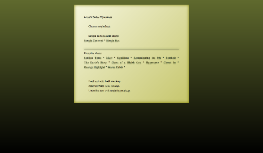
"Sodden Tome"
This requires Twine 1.4. Designed for slimy gloomy or spooky stories. "Wow! It really looks like it fell in a swamp!" - Marsh Boggart 341, Death Quadrant 9.
html {
  background-image: linear-gradient(to bottom,  hsl(70, 39%, 30%), black);
  background-image: -webkit-linear-gradient(top,  hsl(70, 39%, 30%), black);
  background-attachment: fixed;
  background-color: black;
}
body {
  background-color: transparent;
  margin: 2% 0 0 0;
  font-size: 100%;
}

#passages {
  background-image: linear-gradient(-135deg, beige, #c6c66c);
  background-image: -webkit-linear-gradient(-45deg, beige, #c6c66c);
  background-color: beige;
  width: 40%;
  margin:auto;
  margin-bottom: 5%;
  padding: 2em;
  box-shadow: inset 0 0 2em olive;
}

.passage {
  margin: 0px;
  padding: 2em;

  /* Text formatting */
  color: black;
  font-family: "Times New Roman", serif;
  text-align:justify;
}
.passage br + .char {
  margin-left: 1.6em;
}

.char.e + .char, .char.t + .char, .char.a + .char, .char.o + .char, .char.i + .char, .char.n + .char, .char:nth-child(8n) {
  text-shadow: 0em 3px 0.3em hsla(82, 39%, 20%, .25);
  color: rgba(0,0,0,0.7);
}

/* No sidebar */
#sidebar {
  display:none;
}

hr {
  border: 0;
  height: 2px !important;
  background-color: black;
  box-shadow: 0 0 1em darkolivegreen;
}

/* Links */
.passage a .char {
  color: hsla(82, 39%, 20%, .75);
  text-shadow: 0em 3px 0.2em hsla(82, 39%, 20%, .25), 0em 6px 0.4em hsla(82, 39%, 20%, .25);
}
.passage a:visited .char {
  color: hsla(37, 39%, 20%, .75);
  text-shadow: 0em 3px 0.2em hsla(37, 39%, 20%, .25), 0em 6px 0.4em hsla(37, 39%, 20%, .25);
}
.passage a:hover {
  text-decoration: none;
}
.passage a:hover .char {
  color: darkgreen !important;
}
.passage a:visited:hover .char {
  color: darkred !important;
}
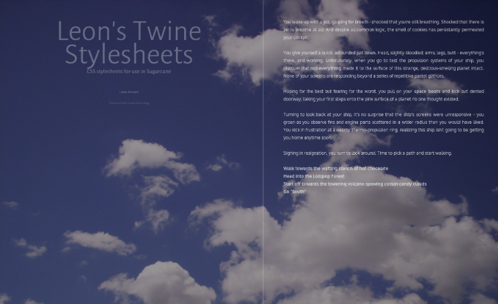
"Muet"
This requires Twine 1.4. The background image is not included - but if you add an embedded image with the name "background", it will be used by this stylesheet! Also, this has no sidebar, only the StoryTitle, StorySubtitle and StoryAuthor.
@import url(http://fonts.googleapis.com/css?family=Alegreya+Sans:300|Oxygen:400,700&subset=latin,latin-ext);

html {
  background: [img[background]] fixed, dodgerblue;
  background-size: cover;
  min-height: 100%;
  height:100%;
}
body {
  background-color: rgba(0,0,0,0.4);
  background-attachment: fixed;
  margin: 0;
  padding: 0% 15% 0% 5em;
  font-size: 100%;
  font-family: Oxygen, "Century Gothic", sans-serif !important;
  font-weight: 300;
  min-height: 100%;
}
#sidebar, #passages {
  padding-top: 4em;
  padding-bottom: 0em;
}
#passages {
  margin-left: 60%;
  width: 50%;
  min-height: 100%;
  padding-bottom: 0;
  margin-bottom: 0;
  border: 0;
}
#passages::before {
  border-left: 3px solid rgba(255,255,255,0.2);
  position:fixed;
  height:100%;
  left: 50%;
  top:0;
  content:'';
}
.passage {
  margin: 0px;
  color: white;
  opacity: 0.7;
  font-size: 100%;
  text-align:justify;
  margin:auto;
  padding: 0px 0px 5em 0px;
}
.passage a {
  color: #cde8ff;
  opacity: 1;
}
.passage a:hover {
  color: white;
  text-decoration: none;
  border-bottom: 1px white solid;
}
.passage a:visited {
  color: #d7ffcd;
}
#sidebar {
  left: 1em;
  width: 50%;
  font-family: "Alegreya Sans","Century Gothic",sans-serif !important;
}
#sidebar li {
  color: white !important;
  text-align: center;
  opacity: 0.3;
}
#sidebar #storyTitle {
  font-size: 4em;
  line-height:0.8em;
}
#sidebar > :not(.storyElement) {
  display:none;
}
/* Shrink the page when viewed on devices with a low screen width */
@media screen and (max-width: 1600px) {
  .passage, #sidebar { font-size: 90%; }
}
@media screen and (max-width: 1200px) {
  #sidebar { font-size: 70%;}
  .passage { font-size: 85%;}
}
@media screen and (max-width: 960px) {
  #passages::before { display:none; }
  #sidebar { position: relative; width: 100%;}
  #passages { margin: 0; padding: 5%; width: 90%; border: 0; }
}

"Simple Centered"
The "simple" stylesheets are designed to be shorter and more customisable than the others. This one simply consists of passage text, centered horizontally AND vertically inside the window, along with a colour gradient background. See the code comments for places where colours and values can easily be changed.
html {
  width: 100%;

  /* Vertical colour gradient */
  background-image: linear-gradient(to bottom,  black, midnightblue);
  background-image: -webkit-linear-gradient(top,  black, midnightblue);
  background-attachment: fixed;

  /* Fallback colour */
  background-color: midnightblue;

  /* Vertical centering */
  height: 100%;
  display: table;
}
body {
  /* Remove default styles */
  font-size: 100%;
  background-color: transparent;
  margin: 0;

  /* Vertical centering */
  height:100%;
  display:table-cell;
  vertical-align: middle;
}
#passages {
  border-left: 0px;
  margin: 0;
  /* Keep a gap at the top and bottom of the page,
      when the text is longer than the window's height. */
  padding: 5% 0;
}

.passage {
  /* Passage width */
  width: 60%;
  /* Horizontal centering */
  margin: 0 auto;

  /* Text formatting */
  color: white;
  font-size: 100%;
  text-align:center;
}

/* No sidebar */
#sidebar {
  display:none;
}

/* Links */
a.internalLink, a.externalLink {
  color: cornflowerblue;
}
a.internalLink:hover, a.externalLink:hover {
  color: lightskyblue;
  text-decoration: none;
}

/* Shrink the page when viewed on devices with a low screen width */
@media screen and (max-width: 960px) {
  .passage { font-size: 90%; width: 70%; }
}
@media screen and (max-width: 840px) {
  .passage {  font-size: 87.5%; width: 80%; }
}
@media screen and (max-width: 720px) {
  .passage { font-size: 75%; width: 90%; }
}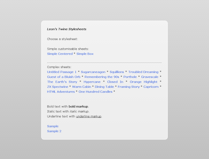
"Simple Box"
Displays the passage text in a box, centered in the upper middle of the page, in front of a colour gradient.
See the code comments for colours and values that can be customised.
html {
  /* Vertical colour gradient */
  background-image: linear-gradient(to bottom,  gainsboro, silver);
  background-image: -webkit-linear-gradient(top,  gainsboro, silver);
  background-attachment: fixed;

  /* Fallback colour */
  background-color: silver;
}
body {
  /* Remove default styles */
  background-color: transparent;
  margin: 10% 0 0 0;
  font-size: 100%;
  /* Used to center the box */
  text-align: center;
}

#passages {
  /* Box background (white with 70% opacity) */
  background-color: rgba(255, 255, 255, 0.7);

  /* Border */
  border: 2px solid white;

  /* Rounded corners */
  border-radius: 1em;

  /* Box width */
  width: 60%;

  /* Center the box */
  display: inline-block;
  min-height: 40%;
  margin:auto;
  margin-bottom: 5%;
  padding: 0px;
}

.passage {
  margin: 0px;
  /* Inner margin within the box */
  padding: 2em;

  /* Text formatting */
  color: black;
  font-size: 100%;
  text-align:justify;
}

/* No sidebar */
#sidebar {
  display:none;
}

/* Links */
a.internalLink, a.externalLink {
  color: royalblue;
}
a.internalLink:hover, a.externalLink:hover {
  color: deepskyblue;
  text-decoration: none;
}

/* Shrink the page when viewed on devices with a low screen width */
@media screen and (max-width: 960px) {
  .passage { font-size: 90%;}
  #passages { width: 70%; }
}
@media screen and (max-width: 840px) {
  .passage {  font-size: 87.5%; }
  #passages { width: 80%; }
}
@media screen and (max-width: 720px) {
  .passage { font-size: 75%; }
  #passages { width: 90%; }
}

"Squillions"
"It's a Twine game that you can imagine James Bond playing." ? Ian Bogost.
head {
  box-shadow: inset 0px 0px 30em #bbb;
  width:100%;
  height:100%;
  display:block;
  position:fixed;
}
head * {
  display:none;
}
body {
  background-color:#fff;
  margin: 0;
  text-align:center;
}
#passages {
  border-left: 0;
  margin: 0;
  padding: 0;
  line-height:100vh;
}
.passage {
  position:absolute;
  top: 0;  bottom: 0;  left: 0;  right: 0;
  width: 75%;
  height: 75%;
  margin:auto;
  font: bold 6em/1.25em Helvetica, "Helvetica Neue", Arial, sans-serif;
  color: #000;
  letter-spacing: -0.05em;
  text-align:center;
}
#sidebar {
  display:table;
  position:fixed;
  top: 0; left: 0;
  width:100%;
  height:100%;
}
#sidebar #title {
  display:table-cell;
  vertical-align:middle;
  text-align:center;
}
#sidebar #title #storyTitle {
  font: bold 12em/1.25em Helvetica, "Helvetica Neue", Arial, sans-serif;
  letter-spacing: -0.05em;
  color:rgba(0,0,0,0.15);
}
#title :not(#storyTitle){
  display:none;
}
#storymenu, #snapback, #restart, #share, #credits {
  display:none;
}
a.internalLink:hover, a.externalLink:hover {
  color:#de0000 !important;
  text-decoration: none;
}
a.internalLink:nth-child(3n), a.externalLink:nth-child(3n) {
  color: #666;
}
a.internalLink:nth-child(3n+1), a.externalLink:nth-child(3n+1) {
  color: #777;
}
a.internalLink:nth-child(3n+2), a.externalLink:nth-child(3n+2) {
  color: #888;
}
@media screen and (max-width: 960px) {
  body { font-size: 50%; }
}
@media screen and (max-width: 840px) {
  body { font-size: 40%; }
}
@media screen and (max-width: 720px) {
  body {
    font-size: 30%;
  }
}
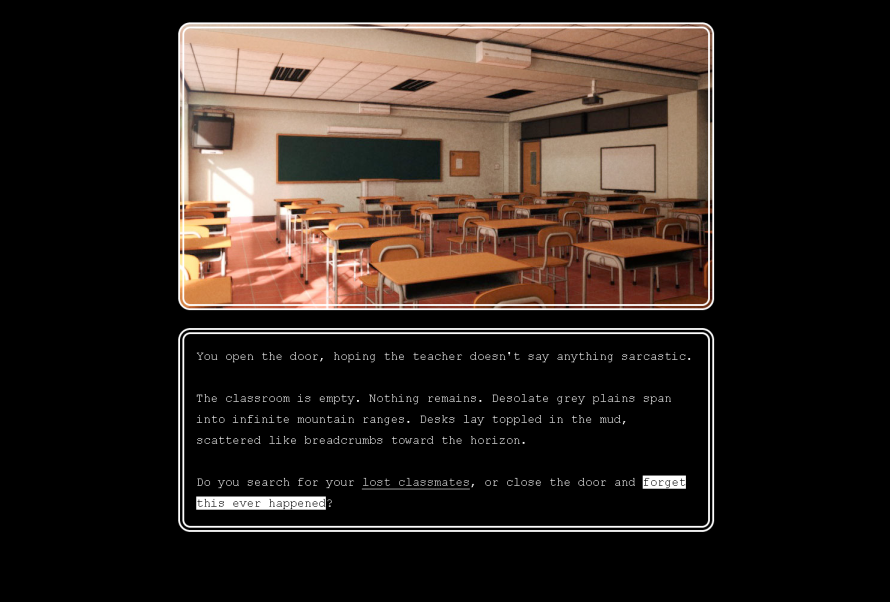
"The Earth's Story Illustrated"
Best used with a dissolve transition.
This stylesheet is capable of displaying a 480-pixels-tall scene image above every passage's text! You can set scene images using Tag CSS. To assign, say, the image "classroom_afternoon" to the tag "classroom", simply create a stylesheet tagged "stylesheet classroom" and put this in it:
.passage .header {
  background-image: [img[classroom]];
}
And then tag various passages with "classroom" to use the image. To have multiple images overlaid on each other, add multiple img declarations separated by commas, in order from frontmost to rearmost:
.passage .header {
  background-image: [img[character-funnycry]], [img[classroom]];
}
That's how you do it!
#sidebar {
  display:none;
}
body {
  margin: 0;
  padding: 0;
  height:100%;
}
#passages {
  margin:0;
  padding: 0;
  height:100%;
}
#passages * {
  box-sizing: border-box;
  -moz-box-sizing: border-box;
}
.passage {
  position:relative;
  width: 60%;
  font-size:2em;
  font-family: "Lucida Sans Typewriter", Consolas, Monaco, monospace;
  margin: 2em auto 0 auto;
}
.passage .header {
  width:100%;
  height:480px;
  min-height: 480px;
  border: #fff double 0.5em;
  border-radius: 1em;
  margin: 0 auto 1.5em auto;
  padding: 0;
  background-position: center;
  background-repeat: no-repeat;
}
.passage .content {
  top: 500px;
  width:100%;
  border: #fff double 0.5em;
  border-radius: 1em;
  padding: 1em;
}
a.internalLink, a.externalLink {
  border-bottom: solid #fff 1px;
  color:#eee;
  font-weight:normal;
}
a.internalLink:hover, a.externalLink:hover {
  text-decoration:none;
  border-bottom: none;
  color:#000;
  background-color:#fff;
  font-weight:normal;
  padding-left: 0;
}
a.internalLink:active, a.externalLink:active {
  border-bottom: 0;
}
@media screen and (max-width: 960px) {
  .passage {
    font-size: 1.5em;
  width: 75%;
  }
}
@media screen and (max-width: 640px) {
  .passage {
    font-size: 1.25em;
  width: 95%;
  }
}

"Remembering the 90's"
Best used with an instant passage transition.
body {
  background:LightGrey;
  color: #000;
  font: medium "Times New Roman", Times, serif;
  margin: auto;
  padding: 8px;
}
#passages {
  margin: auto;
  border: 0;
  padding: 0;
}
.header, .footer {
  border: 1px inset;
  margin: 0.5rem auto;
}
.passage {
  font: inherit;
  line-height: inherit;
  margin: auto;
}
.passage ul {
  padding: 0;
  text-align: left;
}
.passage li {
  display:inherit;
  margin: 0;
}
a, #sidebar #snapback, #sidebar #restart, #sidebar #share, .menu div {
  font-weight:inherit !important;
  text-decoration: underline !important;
  color: #00F !important;
}
a.visited {
  color: #7F007F;
}
#sidebar {
  font: inherit !important;
  position:static;
  width: auto;
  list-style: disc outside;
}
#sidebar ul {
  padding: inherit;
}
#sidebar li {
  color: inherit;
  text-align:inherit;
  margin:inherit;
  display:inline;
}
#sidebar #titleSeparator {
  display:none;
}
#sidebar #title, #sidebar #title:hover {
  color:inherit;
}
#sidebar #storyTitle, #sidebar #storyTitle:hover {
  font-size: 2rem;
  margin: .67rem 0;
  font-weight:bold;
}
#sidebar #storySubtitle {
  font-size: inherit;
  font-weight:bold;
}
#sidebar #storyAuthor::before {
  content: "by ";
}
#sidebar #storyAuthor {
  font-size:medium;
  display:block;
  font-weight:bold !important;
}
#sidebar #credits {
  display:block;
  font-size: smaller;
  padding: inherit;
}
#snapbackMenu::before {
  content: "Rewind to:";
  font-weight:bold;
}
#shareMenu::before {
  content: "Share this story at:";
  font-weight:bold;
}
.menu::before {
  content: "Rewind to:";
  font-weight:bold;
}
.menu, .menu div:hover {
  position: static;
  background-color:inherit;
  color:inherit;
  opacity:1;
  border:0;
  font:inherit;
  line-height:inherit;
}
.menu div {
  margin: 0 1.12rem;
  display: list-item;
  list-style:disc outside;
}

"Porthole"
Features: Very roughly inspired by the title screen of "The Sea Will Claim Everything"; Designed for games with brief passage text. No sidebar.
body {
  width: 100%;
  margin-left: 0;
  text-align:center;
}
#passages {
  position:relative;
  display:inline-block;
  font-size: 1.5em;
  background-color:skyblue;
  background-image: -webkit-linear-gradient(top, #87ceeb 0%,#87ceeb 75%,#008eed 75%,#008eed 100%);
  background-image: linear-gradient(to bottom, #87ceeb 0%,#87ceeb 75%,#008eed 75%,#008eed 100%);
  width: 60em;
  height: 60em;
  border-radius: 30em;
  border: darkgoldenrod 1em solid;
  margin-left: 0;
  padding-left: 0;
}
.passage {
  position: absolute;
 text-align:center;
  top: 20em;
  bottom: 0;
  margin: -10em 5em auto 5em;
  display:inline-block;
  width: 40em;
  height: 40em;
  overflow-y: hidden;
  box-shadow: 0 0 2.5em 2.5em;
}
a.internalLink, a.externalLink {
  color: white;
  font-size: 1.2em;
}
a.internalLink:hover, a.externalLink:hover {
  color: white;
  text-decoration: none;
  text-shadow: 0 0 0.5em white;
}
.passage .body {
  color: white;
}
#sidebar {
  display:none;
}
@media screen and (max-width: 960px) {
  body { font-size: 55%; }
}
@media screen and (max-width: 840px) {
  body { font-size: 45%; }
}
@media screen and (max-width: 720px) {
  body { font-size: 40%; }
}

"The Earth's Story 1.0"
Features: No sidebar. Similar to ZX Spectwine, below. Reminiscent of early 90s Nintendo RPGs - hence its gray sensibilities. Use Tag CSS and tag your passages "mint", "strawberry", "banana" or "peanut" to get different coloured borders for specific passages!
body {
  margin: 0;
  background-color:#000;
}
#passages {
  margin: 0;
  padding: 0;
  border: 0;
}
.passage {
  width: 40%;
  min-width: 26em;
  height: 33%;
  min-height: 33%;
  font-family: Helvetica, "Helvetica Neue", Arial, sans-serif;
  letter-spacing: 0.1em;
  padding: 1.5em;
  padding-left: 2em;
  font-size:1.8em;
  background-color:#000;
  color:#eee;
  margin: 10%;
  border: silver ridge 0.8em;
  border-radius: 1em;
}
.passage[data-tags~=mint] {
  border-color: MediumAquaMarine;
}
.passage[data-tags~=strawberry] {
  border-color: HotPink;
}
.passage[data-tags~=banana] {
  border-color: Gold;
}
.passage[data-tags~=peanut] {
  border-color: Peru;
}
.content::before {
  content: '•';
  position: relative;
  left: -0.6em;
  margin-right: -0.4em;
}
a.internalLink, a.externalLink {
  border-bottom: solid #fff 1px;
  color:#eee;
  font-weight:normal;
}
a.internalLink:hover, a.externalLink:hover {
  text-decoration:none;
  border-bottom: solid #fff 2px;
  color:#fff;
  font-weight:normal;
  padding-left: 0;
}
a.internalLink:active, a.externalLink:active {
  border-bottom: 0;
}
#sidebar {
  display:none;
}
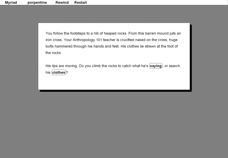
"Hypercane 1.1"
As used in Myriad
Features: Sidebar is converted to a top bar (minus Share); vaguely resembles System 6, but nowhere near enough for true aficionados.
body {
  margin: 10% 0 10% 0;
}
#passages{
  margin: 0;
  padding: 0;
  border: 0;
}
.passage, #sidebar * {
  font-family: Geneva, "Helvetica Neue", Helvetica, sans-serif;
  color:#000;
  text-align:left;
}
.passage {
  border-radius: 0.2em;
  width: 60%;
  margin: auto;
  padding: 2em;
  font-size:1.5rem;
  background-color:#fff;
  border: solid #000 0.05em;
  box-shadow: #000 0.5em 0.5em 0;
}
a.internalLink, a.externalLink {
  border: solid #000 0.05em;
  white-space: nowrap;
  padding: 0.1em 0.2em 0.1em 0.2em;
  border-radius: 0.5em;
  color:#000;
}
a.internalLink:hover, a.externalLink:hover {
  text-decoration: none;
  box-shadow: #000 0 0 0 0.1em;
  color:#000;
}
a.internalLink:active, a.externalLink:active {
  color: #fff;
  background-color:#000;
}
body {
  background:url(data:image/png;base64,iVBORw0KGgoAAAANSUhEUgAAAAQAAAAEAQMAAACTPww9AAAABGdBTUEAALGPC/xhBQAAAAZQTFRFAAAA////pdmf3QAAAA5JREFUeF5jOACEBgwGAAnIAeGomjuiAAAAAElFTkSuQmCC);
}
#sidebar {
  position:absolute;
  top:0px;
  left:0px;
  width:99.2%;
  overflow-x:hidden;
  background-color:#fff;
  border-bottom: solid #000 1px;
}
#sidebar * {
  color: #000 !important;
  font-size:1.5rem;
  background-color:clear !important;
  display:inline !important;
}
#sidebar a:hover, #sidebar #snapback:hover,  #sidebar #restart:hover {
  text-decoration:underline !important;
}
#sidebar a:active, #sidebar #snapback:active,  #sidebar #restart:active  {
  color:#fff !important;
  font-size:1.5rem;
  background-color:#000 !important;
  display:inline !important;
}
#sidebar li, #sidebar li > span {
  margin-left: 1rem;
  margin-right: 1rem;
}
#sidebar a, #sidebar a:hover {
  border: 0 !important;
  box-shadow: none;
}
.menu {
  background-color:#fff;
  color:#000;
  opacity:1;
  font-size: 1.5rem;
  border: solid #000 1px;
  box-shadow: #000 0.1em 0.1em 0;
}
.menu div:hover {
  background-color:#000;
  color:#fff;
}
#credits, #share, #titleSeparator, #sidebar li br {
  display:none !important;
}

"Closed In"
As used in Solitary
Features: No sidebar; Enormous screen-filling font size designed for very terse stories; Font should scale down on mobile devices.
body {
  margin: 2%;
}
#passages{
  margin: 0;
  padding: 0;
  border: 0;
  width:96%;
  margin: auto;
}
.passage {
  font-size:6em;
  color: #888;
  text-shadow: #888 0 0 0.05em;
}
@media screen and (max-width: 960px) {
  .passage {
    font-size: 4em;
  }
}
@media screen and (max-width: 640px) {
  .passage {
    font-size: 3em;
  }
}
a.internalLink, a.externalLink {
  color: #eee;
  text-shadow: #eee 0 0 0.07em;
}
a.internalLink:hover, a.externalLink:hover {
  color: #fff;
  text-decoration: none;
  text-shadow: #fff 0 0 0.09em;
}
#sidebar {
	display:none;
}

"Orange Highlight"
As used in To my Grandma
Features: No sidebar; External links are a different colour to internal links.
body {
  margin: 5% 0 0 0;
  background-color:#000;
}
#passages{
  margin: 0;
  padding: 0;
  border: 0;
}
.passage {
  font-family: "Times New Roman",serif;
  text-align:left;
  color:#000;
  width: 40em;
  padding: 2em;
  font-size:3em;
  background-color:#fff;
  background: -webkit-linear-gradient(left, #aaa 0%,#fff 19%);
  background: linear-gradient(to right, #aaa 0%,#fff 19%);
}
a.internalLink {
  color:#620;
  background-color:hsla(48, 100%, 50%, 0.5);
}
a.externalLink {
  color:#602;
  background-color:hsla(320, 100%, 50%, 0.5);
}
a.internalLink:hover {
  color:#410;
  background-color:hsla(40, 100%, 50%, 0.85);
  text-decoration: none;
}
a.externalLink:hover {
  color:#401;
  background-color:hsla(320, 100%, 50%, 0.85);
  text-decoration: none;
}
a.internalLink:active {
  color:#140;
  background-color:hsla(80, 100%, 50%, 0.85);
  text-decoration: none;
}
a.externalLink:active {
  color:#104;
  background-color:hsla(280, 100%, 50%, 0.85);
  text-decoration: none;
}
#sidebar {
  display:none;
}

"Warm Cabin"
Features: no sidebar; denotes a vague memory of varnished wood as approximated by the MS PowerPoint designers.
body {
  margin: 0;
  padding: 0;
}
#passages {
  margin: 0 5% 0 5%;
  padding: 2.5% 0 5% 0;
  border-left: saddlebrown solid 1.5em;
  height:auto;
  background: #3d1d08;
  background: -webkit-radial-gradient(center, ellipse cover,  #3d1d08 0%,#000000 80%);
  background: radial-gradient(ellipse at center,  #3d1d08 0%,#000000 80%);
}
.header {
  width: 25%;
  border-top: saddlebrown solid 0.1em;
  margin: auto;
  padding: 0 0 2.5% 0;
}
.passage {
  margin: 2em;
  font-family: "Georgia", serif;
  font-size:2.2em;
  color: peru;
  text-shadow: sienna 0.05em 0.05em 0.05em;
}
a.internalLink, a.externalLink {
  color: burlywood;
  text-shadow: peru 0.05em 0.05em 0.05em;
}
a.internalLink:hover, a.externalLink:hover {
  color: cornsilk;
  text-decoration: none;
  text-shadow: peru 0.05em 0.05em 0.05em;
}
#sidebar {
	display:none;
}
Feel free to report any bugs to @webbedspace.
Comments
a question
This is great, thank you so much for your work.
I have a question : why is the fade-in transition working with the text and not with the background in "Untitled passage 1" while in other styles (like "dining table") the transition is applied to the whole passage including background (white semi-transparent box) ?
What I am trying to do is to use the "dining table" stylesheet and I do not want to go for instant transition because I like the text fading in / fading out. However, having the box fading in is tiring for the eyes so i would like to apply the transition only to the text itself and not to the background.
I am unfortunately pretty lame at CSS and code in general but improving a lot thanks to people like you
You could try the dissolve
You could try the dissolve transition?
Other than that, I guess I could make a few adjustments...
Did not work
Thank you for your help. Unfortunately, I could not solve the problem even using the dissolve transition, so I've decided to close my eyes on this minor flaw :)
I released the game, it's a puzzle game made in twine, and it's called Hanoi Circus. You can try it at www.lilinx.com/hanoicircus/
Anyway thank you again for your great work. Thanks to people like you, people like me can actually make games!
awwwwww yeah
That's some real grove street style now.
Hey hey hey L!
Is the sidebar (well technically a topbar) on the Remember the Nineties CSS extensible? Like, if I add a new option on the story menu would it show up as normal?
Edit: I guess that question goes for all of the CSS's that still have the sidebar.
May I ask why you seem to be
May I ask why you seem to be culling these? There are some that I'm sad to see go, and I'm hoping they're just being rejigged to play nice with Twine 1.4.
blinking border
just wondering for the "The Earth's Story 1.0" is there anyway of having the border blinking?
All the CSS style sheets
All the CSS style sheets created by you are awesome. I love the first style sheet that shows the real creativity of you people in the CSS. You are more than a graphic designer. Because you can do all these in CSS, you are brilliant in designing. http://www.windows8vswindows10.com
The Earth's Story Illustrated + menu?
Hi! First of all, awesome stylesheets!
I've been using The Earth's Story Illustrated for a interactive story I'm creating, but I have a little bit of a problem: the story's pretty big, so it would be useful to have a "Save" or "Bookmark" button of some sort so that readers don't have to come back to the beginning of it every time.
Is there some code I can add to the stylesheet's CSS to make it have a "Bookmark" button?
Thanks in advance!